CSS Media Queries
基本上使用情境就是在不同尺寸下,開發者想要使用同一份 HTML 但想要不著不同的版面配置。
@media 是 CSS3 新屬性,而 Queries 就是查詢的意思。
Media 呼叫
在 HTML 中把 media 條件加入
<link rel="stylesheet" media="screen and (min-width: 768px)" href="test.css">
直接寫在 css file
@media screen and (min-width: 768px) and (max-width: 992px) {
    a {
        color: red;
    }
}
在 css file 使用 @import
@import "test.css" screen and (min-width: 992px) and (max-width: 1200px)
Queries 基本用法
@media [media type] and [(media feature)]
有 not, and, only 但我們就最常用的是 and,很容易記而且對有邏輯概念的人來說最好上手。
and 範例
單一條件
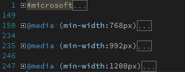
@media screen and (min-width: 768px) {
css...
}
兩種條件以上
@media screen and (min-width: 768px) and (max-width: 992px) {
css...
}
兩種條件符合一種即可
@media screen and (min-width: 768px), screen and (min-width: 992px) {
css...
}
only 範例 - 有些瀏覽器不支援 Media Queries,但支援 Media Type,可使用 only 去阻擋瀏覽器讀取。
<link rel="stylesheet" href="test.css" media="only screen and (color)">
not 範例 - 用來排除某些條件,以下是彩色螢幕不會套用但是彩色列表機會套用設定。
@media not screen and (color), print and (color) {
    css...
}
最佳實務應用
思維轉換請由小裝置寫到大裝置,永遠使用擴增或是複寫屬性。
反過來的意思就是如果你要從大設計到小,表示你要複寫掉更多的屬性。